The NC Local Health Department Accreditation Program website is what you might expect – dense with information and intended for a very specific audience. But that didn’t keep the NCLHDA team from finding ways to improve it. I partnered with them to refresh the look and feel, revisit the content navigation and organization, and make it more user-friendly.
Below is a screenshot from a section of the homepage and highlights from the project. Check out the live site to get the full effect.
UPDATED HOMEPAGE:
ORIGINAL HOMEPAGE:
Hosting & Platform Considerations: Due to a small budget and limited timeline, we decide to move to WordPress because it’s free and supported by the University, makes it easier to have multiple editors if needed, and offers a variety of modern and responsive templates. It also offers widgets that minimize some of the manual updates required on the existing site, such as an event calendar and blog for news updates.
Look and Feel: Although the site content requires a lot of text, we chose a clean template with a current and responsive design. We incorporated more visuals and images on the homepage to welcome users and invite them to explore the content.
Hompeage: We revisited the homepage content to improve the value of the page, adding an intro to explain the purpose of the site, quick links to popular pages, and blog and calendar widgets to highlight what is new.
Content Review: In our user survey we confirmed that most people use the site to find specific information, resources, and documents for the accreditation process, and that there was room for improvement in organization. We worked from a sitemap to regroup content and update wording to make things easier to find and eliminate duplicate content. We also removed click-thru pages that simply another step for the user to get to what they need.
Adding Analytics: The prior site did not have Google Analytics set up so we put that in place on the new site so that we have additional insight going forward and can make adjustments based on the actual user behavior.
See the live site at tourify.city. Because this site is hosted on a free platform (Heroku), the data may take a few seconds to load or require a page refresh.
The final assignment at The Iron Yard was a group project that brought together everything we’d learned over the previous twelve weeks – front and back end integration, responsive design, agile work process, and of course teamwork and collaboration.
My project pitch was Tourify, a travel app for interactive tour experiences. Having worked at the Durham Convention & Visitors Bureau (DCVB), I knew they had an existing print tour that would be more dynamic in a digital format. With DCVB’s permission to use the content and about three weeks to make it happen, our team jumped right in.
I served as the project lead as well as a front end designer and developer. Checkout out the live site at tourify.city and read about the design and development process below.
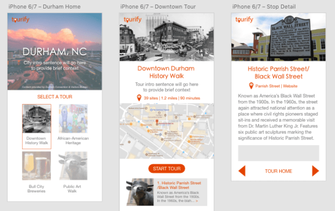
Durham Homepage
Downtown Durham History Walk Homepage
PLANNING
The first several days were devoted to planning – fleshing out our user stories, sketching wireframes, and discussing the key functionality and data that would power the app.
We identified two main users:
The traveler who would interact with the front end tour content while out and about in the city.
The content creator, such as the DCVB, who would create, upload, and maintain the content from a backend interface.
Developing user stories for the Traveler and Content Creator/Admin
Next we took the tour ourselves, using the existing print guide to evaluate the current experience. The content was interesting but there were a few issues. It was hard to tell if you were at the right location and a lot of information was left off due to the compact nature of the piece. We decided that the addition of photography and travel tips would create a better experience.
Taking the tour in Downtown Durham
Pulling together our user stories and on-the-ground research, we identified the key features for the app:
Front End:
Easy-to-use interface designed for mobile, but responsive on any device/screen
Single page React app that uses components and dynamic URLs to change content as user interacts with the app
Ability to show stop locations and detect user’s current location via Google Maps API
Ability to start tour at first stop or select a starting point based on current location
Built so that additional tour content can be added and easily integrated
Back End:
Database to store data and serve it to the front end via fetch API call
Interface for content creator to add new tours or edit existing tours
Ability to add/delete/edit tour and stop info
Ability for content creators to make account to save and store tour content
INTERFACE DESIGN & BRANDING
As part of the front end team and someone who enjoys the design process, I used Adobe XD to transform the wireframes into mock-ups. I knew it would make the coding and styling process easier if we were all working from shared styles and brand guidelines.
I created the Tourify logo in Illustrator, identified brand colors and fonts, and shared these elements with the team for feedback.
Site mockups created using Adobe XD
DEVELOPMENT
Our front end and back end teams split up to code our respective parts of the project, but worked closely together throughout the process. On front end, I built the route and component for the tour home page, created the dynamic routes, and set up the initial fetch to pull in the API data. I also did a majority of the CSS for the front and back end.
Initially we built the app as a combined Rails-React app but about a week in continued to have trouble getting both front end and back end routes to work. After talking to a prior Iron Yard grad, we decided to abandon this approach and split out into separate React and Rails apps. From that point on we were able to move faster, particularly on front end.
Once we got the main features built – including the main parts of the front end traveler interface and the working database – we were able to focus on additional features including the Google maps integration and creating the admin interface.
DEPLOYMENT & DEMO DAY
Both the front and back end sites are deployed on Heroku:
The final days of the project overlapped with a tech conference, so much of our communication became virtual. We had a few last minute conflicts, but nothing that couldn’t be fixed with the help of version control in Git/Github. We had an ambitious team and a lot of ideas, so it was hard to reach a stopping point until demo day was upon us.
Our team got to present last at Demo Day and bring it home for the final Iron Yard presentation. We got a lot of great feedback and have some things to think about in terms of the future of the project. If we continue, we’d like to add additional functionality for the traveler such as the ability to save stops or check in and earn badges or discounts.
It was very rewarding to go from idea to working app over just under three weeks. With the help of a great team we presented a great product that we are truly proud of.
Team Tourify
A few previews of the back end admin interface:
Organization homepage with list of current toursStop detail page to review existing content for each stop
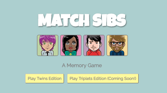
One of my front end projects at The Iron Yard is an interactive memory game built with HTML, CSS, and JavaScript. Using DOM manipulation, the cards change appearance as the user interacts with the game. (Check out the game and give it a try).
Flexbox was used to control the spacing and placement so that most elements will resize for various devices. However, the game board for the card is not currently responsive.
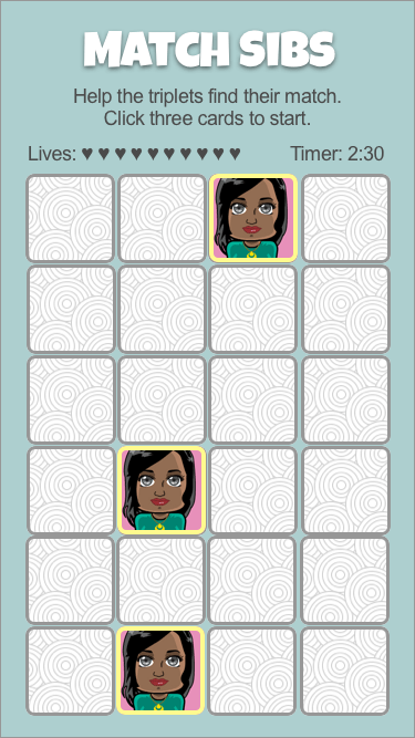
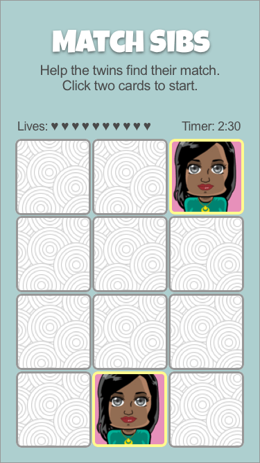
I used Sketch to revisit the project and mock up the home screen and game board for mobile. Below are the prototypes followed by the considerations for scaling down the game.
These prototypes are based on an iPhone 7 with a screen size of 667 x 375.
In a memory matching game it is ideal for the full game board to be in view so the player can build a mental record of each card’s location as they are revealed.
To fit the full board in the mobile window, the card size will need to be reduced.
Eliminating the need to scroll should also reduce the likelihood of stray clicks.
On mobile the player will interact with the cards by touching the screen. For this reason the size of the cards must be considered so that it is easy to select the intended card and see the detail of the image.
After working in Sketch, I decided that 80px would be the minimum size that still allows for ease of selection. It would be ideal to test this with a mix of users.
The 4 column x 4 row card layout that works on larger screens will translate to mobile by reducing the card size from 120px square to 80px square.
This option fits a 16 card game for twins edition (eight pairs) and also accommodate a 24 (eight sets of three) for triplets edition.
Another option would be to opt for fewer but larger cards. This might work for an easy mode with a max of 12 cards (six pairs).
Sketch makes it convenient to visualize and adjust the sizing and layout options vs. playing with these types of details in the code.


 Here's The Dill